Retargeting
5 Secrets to Better Retargeting Ad Design

Retargeting ad design may seem simple, but there’s more to it than you think. Many businesses put little to no thought into their retargeting ad design, thinking that it’s enough to just slap something together and upload it to the nearest ad server. There are plenty of retargeting platforms out there to help you manage ad campaigns, many of which we’ve listed before; but all the data, analytics, and ad managers in the world won’t help if your ad design is terrible. Here are what I’ve found to be the secrets to designing more effective retargeting ads.
Clear and Eye-Catching Retargeting Ad Design
There are five elements that every retargeting ad design absolutely needs. First, an obvious and eye-catching call-to-action (CTA). That’s usually your button that screams, “Click me!” It needs to be a bright color that stands out from the rest of the ad; so if you have a mostly blue ad, don’t make a blue CTA. It has to be big, obvious, and pop out or else it’ll get lost in the noise.
Next is branding—you need users to be able to quickly and easily associate the ad with your company. Many businesses overlook including their logo in their retargeting ads, instead opting to just lure people in with the offer of something free. With retargeting, however, users are seeing your ad because they’ve already been to your site; so you need to remind them that they have encountered your business before, and that’s what the presence of your logo does.
You also need to make sure that every pixel of your ad is properly occupied by one design element or another. With ads as small as they are, you can’t afford to have any empty space. Using large, clear text is one way to fill up empty space; and using large text in your retargeting ad design is also important in making sure that viewers can see what your message is all about. If you try to cram too much text in such a small space, thus forcing you to use a smaller font, you run the risk of people having a hard time reading your ad.
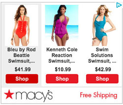
Retail sites in particular are very good at crafting retargeting ads that catch your eye, but they also tend to split the viewer’s focus as well. Take this Macy’s ad below, for example. While it does have their logo displayed clearly so you remember where these swimsuits come from, and while the CTAs are clearly displayed, it gets a little busy with so many different options, which also forces them to use a smaller, more difficult to read font. Nordstrom, on the other hand, shows the viewer one item, gives them the option to roll over the image for other views of the product, and has one, bright red CTA that draws the eye straight to it. I’d still take issue with the fact that their font is so small, though; they definitely could have made the coat description much larger.


The Final Element – Keep the Message Simple and Specific
Retargeting gives you the opportunity to deliver a more specific ad experience to your visitors, and your retargeting ad design should reflect that. If the message is too generalized, then visitors won’t feel compelled by it because it doesn’t speak to them in any real way. In this article over at Business Insider, they use the example of a Travelocity campaign that saw a 651% increase in click-through rates (CTR) just by making their ad a little more specific depending upon what flights visitors looked at when they were initially on the site (see the image below).

An example of an ad that’s woefully non-specific is the Highrise ad on the left-hand side below. Although it has a clear CTA, as well as their logo, the quote is a little too long, and it’s not readily apparent right away that Highrise is a CRM solution unless you look at the logo closely. Of course, the whole reason you’re seeing the ad is because you already visited the Highrise website, so you would probably know what it was; but my point is that the message of the ad itself is not specific enough. The ad on the right, however (which I took the liberty of improving), uses larger text, a shorter message, and gets to the point faster. That’s the sort of retargeting ad design that you want to aim for.


Your Retargeting Ad Design Checklist
So when you’ve finished your ads, be sure to check off each of the following:
- Clear and obvious CTA
- Large, easy to read text
- No empty space
- Your brand logo prominently displayed
- Simple and specific message
Don’t forget that simpler is better, and eye-catching colors and design will go a long way towards bringing up your click-through rates and conversions. If you want to learn more about retargeting best practices, I’d recommend this article from ClickXPosure on how to create retargeting ads that convert.
You can add Amanda to your Google+ circles, and be sure to follow Business-Software.com on Twitter.
Looking for more on digital marketing software? Take a look at our side-by-side comparison of platforms in the Top 10 Marketing Automation Software. You can also browse exclusive Business-Software.com resources on marketing automation software by visiting the marketing research center.


