Landing Page Optimization
The 7 Key Steps to Landing Page Optimization

With 48 percent of marketers building a new landing page for every campaign and 68 percent of B2B marketing teams implementing landing pages for lead generation, it’s a bit of a surprise to see the conflicting strategies around landing page optimization. In researching the best practices for optimization, one will find the opinions of freelance consultants, Fortune 500 analysts and even landing page optimization experts — all with some of the same, but mostly different, views.
Landing pages are used as standalone pages on a company’s website and act as the new age pop-up. Marketing teams often use landing pages for lead generation and to boost interaction (click-through rates) to funnel the viewer to a predefined location. Landing pages may also be used to introduce, highlight or generate buzz about a specific product or offering. These pages typically stray from the look and feel of company websites and boast a slimmed-down effect in terms of design, content and imagery. Most landing pages offer one or two conversion points — which can range from registration or joining a newsletter to requesting more information, etc.
How Do I Optimize My Landing Pages?
If the implementation or optimization of landing pages has been on your to-do list for a while, but the execution is a bit foggy, don’t fret, you are not alone. It’s easy to become overwhelmed when researching and far easier to become overwhelmed when testing new designs of your landing pages.
These seven steps to landing page optimization should give marketers a clear understanding of exactly what’s to come when building out their landing pages:
Step One: Accept the Challenge
The first step in optimizing your landing pages is for both newbies and pros: wrap your head around the complexity of landing page optimization and accept that, similar to Rome, your page most likely won’t thrive in a day. There are handfuls of variables that can affect a landing page’s performance — some of which are so minute, they can be easily overlooked. It’s going to take some time, an abundance of patience and a vat of espresso — but eventually, you will see results.
Step Two: Use the Tools Available
The next step in building out your pages: skip the manual coding and use a tool built for landing page creation and optimization. Most marketers aren’t web developers, so the option of having a drag-and-drop-like builder can make the process exponentially easier and faster. There are tools popping up left and right in the segment — all claiming to be the solution to end all others.
When shopping for your perfect platform, be sure to take a long look into their listed features. Some tools may offer a small selection of pre-built templates, while others may offer a multitude of free and premium template options. Beyond design help, it’s worth looking into product integrations. Use MailChimp for your email marketing or Salesforce to manage your company’s inbound leads? Great! Save some time and let your landing page solution do the work for you by transferring the data automatically.
Note that while it’s easy to get a general sense of the solution by their website, features listing and entertaining animated videos, to get a true sense of the solutions’ strengths and weaknesses, we urge marketers to give the free trials a test drive. It only takes a moment to sign up, and the insight from a few minutes of use can be hugely impactful on your decision.
Step Three: Check Out Pre-Built Options
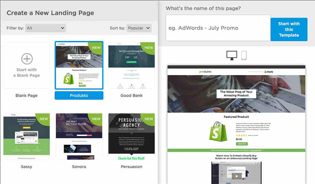
Now that you’ve found the platform of your dreams, or at least one that meets most of the criteria, take some time to explore the pre-built templates. Companies like Unbounce offer an extensive selection of modern designs, customizable to fit your lead generation, click-through or buzz-inducing needs.
Using a pre-built template offers marketers an opportunity to explore ideas they may not have thought of and save countless hours worth of time in the process. What’s more, most solutions with templates have a collection of stock imagery that’s usable on your pages. Instapage, for example, has quite a few stunning background images that can be used across a wide range of industry pages.
When building out your landing page, you’ll most likely run into a couple of design challenges along the way. Arguably the most aggravating is that some tools lack an autosave feature when building, so take a lesson out of the books and be sure to save your progress often! Those with Java experience can alter sections of the page beyond some of the tools’ built-in functionality.

Image courtesy of Unbounce
Step Four: Test, Test, Test!
After you’ve designed your landing page, the next step — and one of the most valuable — is to make a duplicate and begin A/B testing. As previously mentioned, there are many variables that can affect your conversion rates, including font selection or color, headline copy, background design, image selection, button placement, etc.
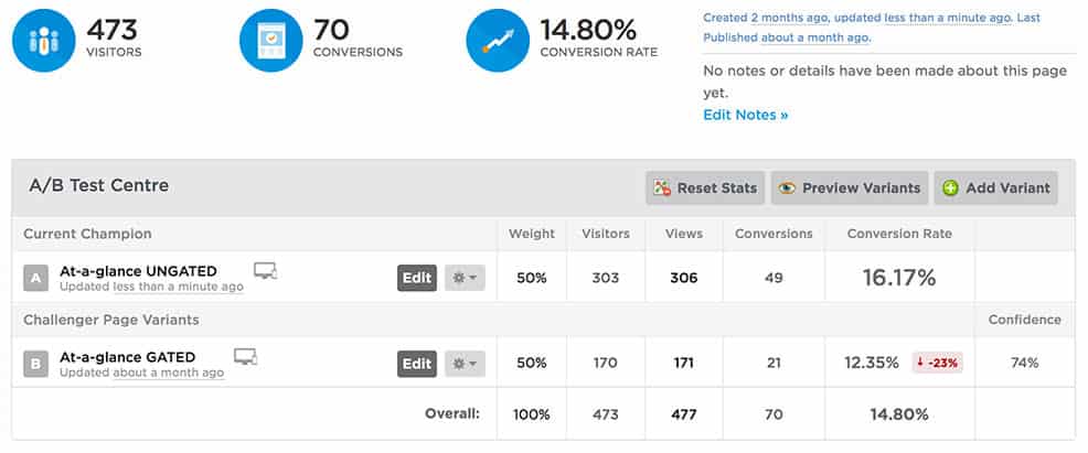
A/B testing pits two or more pages against one another and allows marketers to change some of the variables within the page. For example, when selecting a headline color, marketers may test two different colors, blue and red. While we know the color blue stands for trustworthiness and red evokes the sense of urgency, we may not know the true effect until we test them against one another.

Image courtesy of Unbounce
Step Five: Give It Time
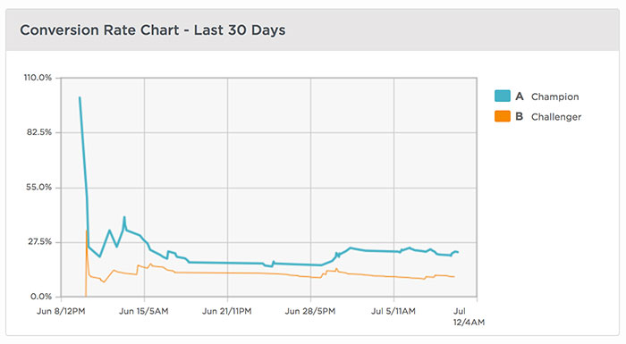
Most marketers and business owners fancy immediate gratification. When building new or optimizing landing pages, it’s important to set that aside and give the pages time to gain traction, reach the target audience and build a large enough sample size from which to draw conclusions . It’s important to note that initial observations may not accurately portray the true success of a landing page. Pages may come out of the gates hot and fizzle over the sample period, or vice versa.
The test period length varies greatly based on traffic. A page with minimal traffic will take longer to establish a clear and accurate analysis than a page that sees hundreds of visitors daily. The ‘ideal number of visitors’ to a page before ending testing varies from a few hundred to a few thousand. We suggest your page reach at least 1,000 visitors before making any conclusions on conversion performance.
Step Six: Analyze the Results
After your page has run for an appropriate amount of time, you may make your conclusions by analyzing the results of the A/B testing. Did the red headline crush the blue? Now would be the time to promote the red headline page to the champion version by assigning it 100 percent of the traffic. Alternatively, you could keep testing the champion variant against a new color to be sure there’s not a better option available.
If page performance is subpar, there may be a few things that have contributed to the demise. Is the mission of your page clear? Include your call to action ‘above the fold’ or where the page cuts off on most standard-sized screens, or try a contrasting color or arrow to serve as a map for the reader’s eyes. Does your form look too daunting? Try a registration form with less fields to see if conversion spikes.
Try not to get discouraged if the page’s performance isn’t what you were anticipating — it may be fixed with a couple of small tweaks.

Image courtesy of Unbounce
Step Seven: Pat Yourself on the Back
Breathe a sigh of relief — you did it! Landing page optimization is neither a quick nor easy strategy. After a couple rounds of A/B testing, any marketer will share how much they’ve learned, how much patience they’ve gained and most likely their favorite curse words during the process of building and testing different variants.
Unfortunately, there’s no magic solution to landing page optimization. There are general ideas and theories that may or may not work for you and your business. In closing, our best advice is to think outside the box — page visitors don’t always act as we think they will. Test the wacky theories, build something different, let your imagination run wild. Look at landing page optimization as a fun psychology experiment, rather than the mysterious concept that it can be — and your pages will shine.
Have you fallen head over heals for a landing page tool? We want to know! Head on over to our Twitter or Facebook page and give your landing page tool a shout out!
[Photo courtesy of Pexels user Ed Gregory.]


